How important is the cover of a book to it’s success? In this post Lee Moyer gives an insightful breakdown of composition, color and typography on two different book covers to reveal a possible reason for why one sold so well and the other didn’t. Originally posted to his personal blog, Lee has graciously permitted me to share it here.
Anatomy of a Murder*
The delightful MK Hobson’s first novel was The Native Star. It was a wonderful book and it was, accordingly, nominated for a Nebula award in the same year that two of Portland’s other great writers, Mary Robinette Kowal and Felicity Shoulders, were.
But when it came time for the second book, The Foreign Anodyne, things got dodgy. The book didn’t sell nearly as well, and who was to blame? Why the author of course! How could the “failure†of the second book be laid at any other doorstep?
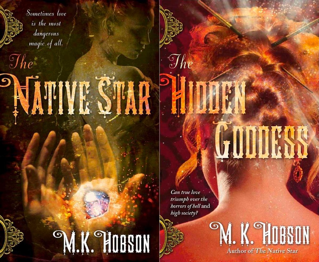
Well, this post will present a small case study** of the two covers, and attempt to discover where it all went wrong. First, I’ll talk about why The Native Star‘s cover design worked.
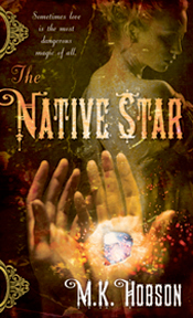
 The Intentional: Great font choices. The bold display font is wonderful – evocative of period and magical. Yummy. The smaller font is elegant and well placed – the whole piece flowing well from top left to bottom right.
The blurb is a statement using ‘love’ and ‘dangerous magic’.
The partial cameos on the left side seem to form hinges, and while the design is not holistic enough to wrap them around the spine, it looks from the front cover that they might.
The choice of stock art is good. The viewer does not understand what the true narrative is, but feels that there is one. Is the man in the foreground giving some woman a gift? Is she disrobing? Is she worried? Interested? We don’t know, but we have enough clues to conjecture ~ and that’s fun.
There is an distressed and torn texture overlaid on the picture. This serves to unite the disparate elements in a way that makes them properly “periodâ€. Further, there are color complements in the form of the deep red notes on the largely weathered green cover. And a proper little touch of blue that completes the composition admirably.
The Accidental: The hand in this piece is supposed to be that of our heroine. The fact that it is the hand of a man, modified slightly at the author’s request, is, I believe, a net gain for the piece. It makes the viewer imposed narrative stronger, and more romantic. The rendering of the jewel in the hand is, if you’ll pardon the expression, ham-fisted. I can’t tell what it is really. I guessed a jewel, but with the rendering one would be as safe to think it’s a tunnel to another universe. And while I would personally hate to have created such a questionable form, I feel that it probably works better than a fully representative version would have. As a title, the words The Native Star are graphic and legible. The letterforms move and flow nicely, one to another. They look and feel nice.
In summation: This cover works and got enough readers in the door to make the book a success. Huzzah!
 And now, book two ~ The Foreign Anodyne.
What? The Foreign Anodyne? But it says The Hidden Goddess I hear you cry!
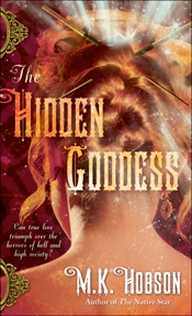
Sadly, almost everything I praise the first cover for above is reversed with this cover. And that’s especially odd given its obvious similarities. How can an attempt to move all the elements from cover 1 to cover 2 be bad? Well, that’s why I’m writing about them. It’s so rare to see such a clear case of sequelitis. Where the book is a sequel, it is by no means a rewarmed version of The Native Star. But the cover is a badly reheated version of its cover.
What it gets right: It keeps the cameo hinges and the bold display font. But even those small victories might be Pyrrhic…
What it gets wrong: Everything. We might argue that The Hidden Goddess is a better title than the vastly more mysterious The Foreign Anodyne, but I’ll call it a draw. Until of course I consider the typography. Since we know that the font will remain the same, there’s no excuse for making the author change her title to something that will look repetitive and illegible ~ 4 Ds, 2 Ss, 2 Es, and a tall I and and O? In a font where Os and Ds look the same? And while the G is a bigger display cap, the rest of the word looks ODD. Or indeed ODDEST. A font that was brilliant when it read The Native Star looks… boring. If, however, it read “The Foreign Anodyneâ€, it would again look spectacular. No sets of double letters, and while you may not know what an Anodyne is, it would look so good that it might not matter. Is it fair to insist that this sort of design choice be considered and arranged? Yes. Is that how most publishing works? Certainly not.
What else is wrong? Well, the rest of it. No color contrast or complements. No mystery. No uniting texture to suggest age. The phrase “true love†combines with an image lovable only to hair fetishists and sellers of hair sticks to make a cover devoid of narrative. The highest contrast our human brains perceive is that of black and yellow, so the black and gold of The Native Star works a treat. There is no similar contrast on The Hidden Goddess. Seeing the background through the hinge cameos creates more interest there than a focused cover wants, and keeping said cameos the same green-gold color draws even more attention to them. The partial substitution of the smaller font, and it’s poor placement is similarly problematic. There is no flow, grace, narrative, mystery or focus to this cover. Hints of period are all well and good, but when the only image looks like an undisguised photo from a contemporary bridal magazine…. well, it’s bound to be a problem.
So, what’s the possible solution? Well, I am pleased to say that I’ll be doing Mary’s next two covers as she takes her writing directly to the people, without walking the curious labyrinth that is traditional publishing. She talks about that here.
As usual, I’ll be putting my money where my big mouth is, and am fully prepared to be held to the same high standards I espouse so freely. And, as ever, I am interested in your thoughts.
Cheers!
Lee
* It turns out that it wasn’t murder per se. More an accidental suicide by the publisher….
**Humorously, Case Study is the name of the neighborhood coffee bar where of the writers I mention herein hang out and work.
********
Lee Moyer is a painter, illustrator, and designer with an impressive repertoire of work and experience under his belt. Originally trained in watercolor and oils, he currently works digitally to create art for games (both video and board), posters, book covers, comics, etc. Recently he created artwork for the documentary Lovecraft: Fear of the Unknown and brought into being a calendar full of Literary Pin-ups. If you’re interested, SciFi Art has an exceptional interview with Lee delving into his process and inspirations. You can see more of his art at LeeMoyer.com

17/02/2012 at 8:44 am Permalink
NARRATIVE.
Oh absolutely.I thank Lou Anders for keying me into the idea that covers can “Tell a story” and that good covers DO that, to get readers interested in the book.Â
22/01/2017 at 6:26 am Permalink
After reading your post i didn’t control myself. I was so emotional and i read the whole article at a time. Thank you so much for your very experience writing.
26/01/2017 at 9:11 am Permalink
Book is main source of exchange by for achieve well knowledge which is the best exchange by best readers. They pick up genuine art demonstration among the people.That is nice article.
28/01/2017 at 11:17 pm Permalink
Book is main source of exchange by for achieve well knowledge which is the best exchange by best readers. They pick up genuine art demonstration among the people.That is nice article.